UX feedback pitfall
I have thoughts about some recorded UX test footage I saw recently. They need time to percolate, but I want to dash off a quick response to one specific comment for future reference.
The test user was looking at a section of a page on a mobile screen, and commented that an image associated with a link to a page about Scottish foods — was "too small… I can't even see what that food is".
The item in question was something like this (constrained to mobile width for scale):

Scotland's 10 best eateries →
Maybe it's relevant that it's part of a stack of similar links?

Trees? Scotland's got them →
Scotland's 10 best eateries →
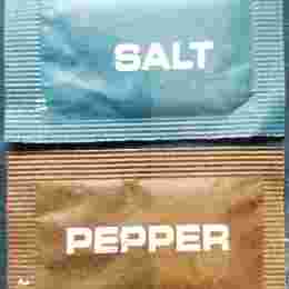
Scotland's top two condiments →
The risk
It's plausible if not inevitable that off the back of the comment "that image is too small for me to see what the food is", an action is defined to redesign and re-implement the component such that the image is bigger.
I don't know how reasonable that proposition seems to someone based on the simplified account I'm giving here, but to me it's very obviously a very bad conclusion to jump to. But this kind of thing happens all the time, and in the real world it's never as clear-cut as my description makes it sound.
All it takes is for someone to pick up on that comment and — with the best of intentions — raise a ticket in some product backlog: "Increase size of link thumbnail". They might even flesh out the ticket with all the kinds of things we've been led to believe a ticket should have, like a user story:
As a user
I want the thumbnail images associated with links to be bigger on mobile
So I can see exactly what they are.
and maybe it's assigned to a PO who tries to define the work further by adding acceptance criteria and refers it to a designer to make some wireframes to specify exactly how much bigger the img elements need to be.
By this stage things are just snowballing. Every time the ticket is discussed or reassigned or reprioritised or updated its sunk cost and its momentum accumulates until it becomes politically impossible for anyone to even question the reasoning behind it, never mind suggest we shouldn't do it.
"Why are we doing this?"
"It came out of user testing."
How do you argue with that?
You can, as I have previously done, doggedly track down and scrutinise the basis on which an odd-sounding decision was made, and make a well-reasoned counter-argument, but the time and effort involved is many orders of magnitude greater than just doing whatever bit of frontend work is required to get this ticket done and off your plate.
The actual problem
So, in this — let me emphasise, hypothetical — case there are several things that we should consider before coming anywhere near suggesting that we literally just do what one random punter suggests in passing.
Firstly, we should exclude this comment from any presentation of the findings on the basis that it has nothing to do with the topic under test. If we're gauging opinions on a specific feature, we should take steps to keep the focus narrow and avoid being distracted by passing comments about distinct UI whose presence is incidental to the test.
One might argue that to completely disregard the comment is throwing away an opportunity; there's a cost associated with user testing and we should take full advantage of any insights it offers. Fair enough, but it needs to be put into a separate queue of observations we might want to assess on their own merits. A comment like this is not grounds for action, but might be worth enought to justify follow-on research.
For goodness sake don't accept this unsolicited feedback uncritically. We need to analyse the comment in the context of what the UI actually is before we consider whether to respond, never mind how. Thumbnail images like these serve a very specific function. They're what I call illustrative images; fungible visual instances of something that's wholly communicated via the primary content — text.
These images are not content. They serve as visual affordances to lower the cognitive processing cost for a subset of users in the same way icons do, by letting sighted users parse the page content quickly and spend their attention effectively. So we might ask ourselves: Why are our users mistaking controls for content? is that something we need to adjust? Does this affordance work as intended across all screen sizes? should we think about removing it on mobile?
There's even a sense in which we can interpret this comment as validation of the UI. The user can tell that image is food, which is literally all we need it to do. Imperfect clarity about the paricular foodstuff might act as an incentive for click-through, if that's what the content designers want.
Even if we did, for some reason, want to insist that images were completely, specifically legible at smaller screen sizes, we'd have to set up some baselines to measure that against: a standardised level of visual acuity, the pixel densities of various devices, the impact of other visual conditions like colour blindness…
And even then we ought first to ask whether this isn't something that should be remediated via the content choice itself. Maybe it's just a badly chosen image and we should replace it with one that reduces more gracefully. Or maybe the link text can be rewritten to provide more context:
Salmon pate & more: great Scottish food →
OK, I think I've made my point here.
END