Better alt text - 1
I saw this post on Mastodon and I liked it. The gag is good and the image has alt text, but it bothers me that the two don't dovetail elegantly, so I've bookmarked it to use as an exercise.
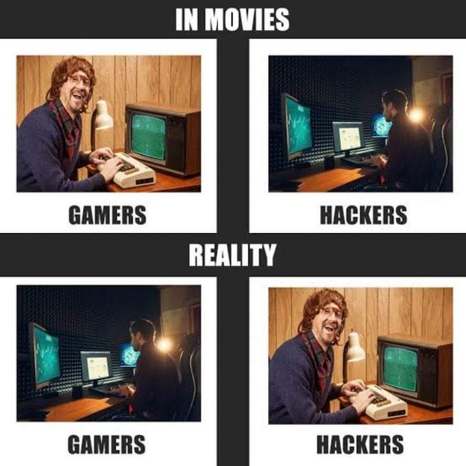
Image without alt text
The supplied alt text
A four-panel meme in a 2x2 grid that contrasts the depiction of gamers and hackers "In Movies" versus "In Reality".
The top row is labeled "IN MOVIES":
The left panel, labeled "GAMERS," shows a man with shaggy hair and glasses, dressed in a sweater, laughing enthusiastically while using a vintage 1980s computer with a green monochrome screen.
The right panel, labeled "HACKERS," shows a sleek, modern computer setup in a dark room, with multiple monitors glowing with green code.
The bottom row is labeled "REALITY," and it swaps the images:
The left panel, labeled "GAMERS," shows the modern, sleek, multi-monitor setup.
The right panel, labeled "HACKERS," shows the man with the shaggy hair and the vintage computer.
Critique
I suspect the core problem is obvious, but let's try to articulate it clearly.
The alt text describes, in a very literal way, the content of the whole image. Objectively, this is not a bad thing for alt text to do. If we were looking at an img element — a .png file — that was entirely a photograph, of a landscape or a city scene, or a family portrait or any number of documentary images, this would probably be the correct approach.
But this is a meme, and that's an entirely different class of thing. It's not good or useful to spend your alt-text budget describing spatial relationships that are only relevant to the visual rhythm of a visual communication method.
The overall effect is of someone laboriously explaining the joke rather than representing it.
Four panel meme? 2x2 grid? top row, bottom row, left and right? row labelling? all of this is structural noise.
Analysis
This is a good example of my ongoing contention that in the majority of cases images on the web should be regarded as affordances for people who can see, rather than alt-text (and other accessibility features) being affordances for people who can't.
This meme isn't funny because of the specific qualities of the specfic images that comprise it. We could subsitute similar pictures and the meaning would would remain intact. We could present the images in a different format and the meaning would remain intact.
This "meme" in reality, should properly be thought of as a visually digestible instance of idea that's perfectly capable of being written.
Response
OK, let me put my money where my mouth is. What should this alt text be? Let's go:
Movies show gamers as '80s dorks laughing in front of vintage CRT screens and hackers as sinister figures silhouetted against multiple LCD monitors. In reality, the opposite is true.
For the sake of transparancy I won't pretend I just dashed that off. It took several minutes to pare it down to the pith, but I think it's a credible attempt.
Of course, not every social media scenario can be reframed as neatly as this — I cherrypick my examples for a reason! — but I think this is a good example of a situation where the content can be primarily textual with an "alt-image" rather than visual content with alt-text.
END